
Perlin Noise Flow Fields
In this post, I’ll generate art based on the idea of a material flowing through an area. Again this was inspired by the the aRtsy package, which has a canvas_flow() function to create such art. However, I like to learn how these generative functions work, so I attempt to write my own function. In the canvas_flow() description, it mentions a post by Tyler Hobbs as a good reference. It does a nice job of walking through the concepts using pseudo code, which I’ll implement in R. For motivation, here’s an image from Tyler’s post that will give you an idea of what I’m trying to create.

Manual Flow Fields
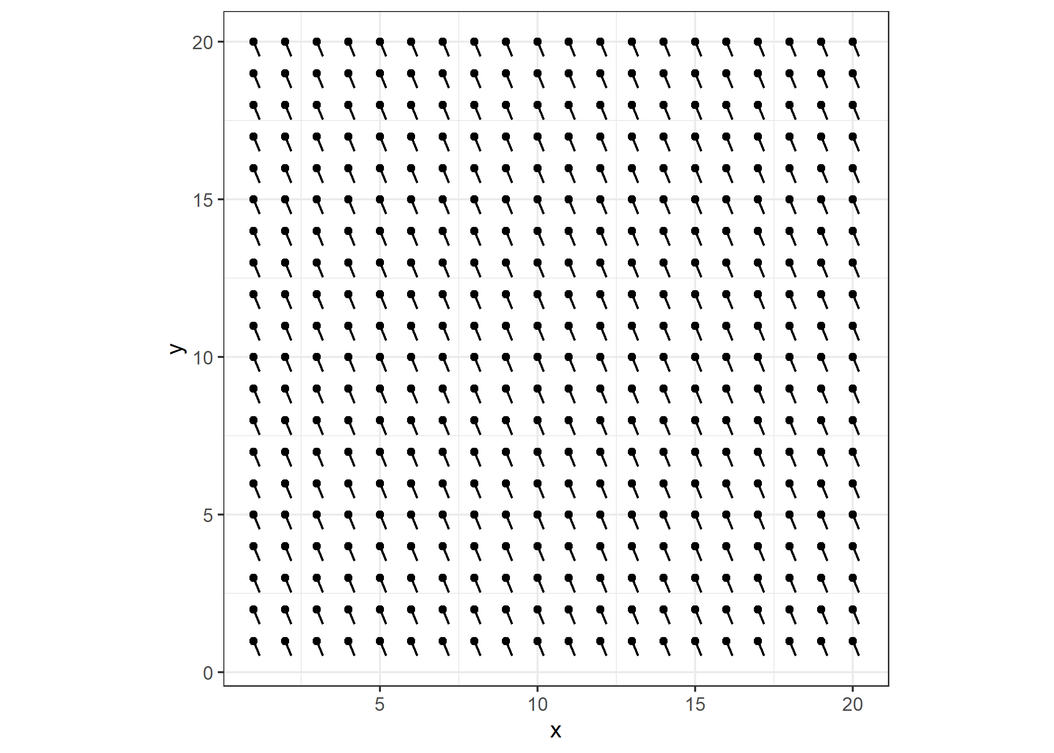
Tyler Hobbs’ post starts here, and I found it useful to understand the basics. First, I’ll start with a 20x20 matrix, and define the flow as being in the same direction uniformly through the canvas. It helped me to visualize that by plotting a dot for every matrix cell with a line segment extending from the dot that indicates the direction of flow. For a uniform field, I populate the matrix with angles equal to (1 5/8)*pi.
m <- matrix((13/8)*pi, nrow=20, ncol=20)
Then, since I’m going to create the plot a few times, I’ll write a function get_plot() that takes the matrix as an argument, and returns the plot I described. First, the necessary libraries.
library(dplyr)
library(tidyr)
library(ggplot2)

theme_set(theme_bw())

get_plot <- function(M) {
  as_tibble(M) %>%
    pivot_longer(everything(), values_to='a') %>%
    bind_cols(expand.grid(x=1:ncol(M), y=rev(1:nrow(M)))) %>%
    mutate(xend = x+cos(a)*0.5, yend = y+sin(a)*0.5) %>%
    ggplot() +
    geom_point(aes(x=x, y=y)) +
    geom_segment(aes(x=x, xend=xend, y=y, yend=yend)) +
    coord_fixed()
}

get_plot(m)
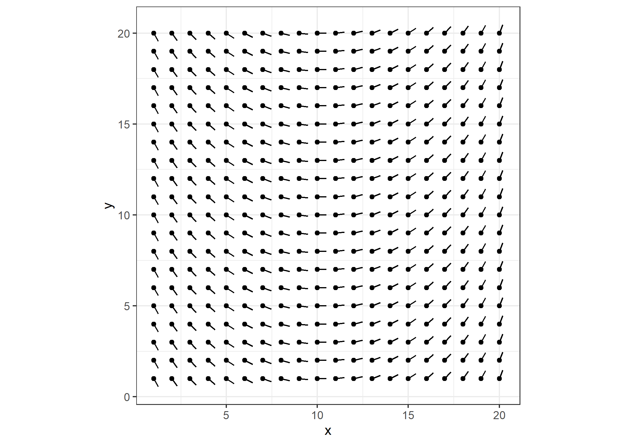
To generate the art, I want to draw individual lines of varying length through the field. The direction each line travels will be determined by the direction specified by the closest dot. Drawing lines through this field wouldn’t be very interesting, so I’ll add some curvature to it.
for (i in 1:ncol(m)){m[, i] <- m[, i] + i/20 * pi*(3/4)}

p <- get_plot(m)
p
Since I’ll generate lines through flow fields multiple times in this post, The function get_lines() takes the flow matrix m as an argument, and also a multiplier segment_length for how long I want the line segments to be and num_lines for how many lines I want to generate. I create a data frame df to store the x and y coordinates of the lines. The initial x and y values are random numbers somewhere within the bounds of the flow matrix. The variable theta contains the value from the flow matrix (an angle) that is closest to the x and y coordinate. A new x and y are then calculated based on theta and these values are added to the data frame. Comments in the code provide the rest of the details.
get_lines <- function(M = NULL, segment_length=5, num_lines=400){
  for (j in 1:num_lines){
    dims <- nrow(M)
    # the actual line segment length
    seg_len <- sample(dims:dims*segment_length, 1)

    df <- data.frame(x=rep(0, seg_len), y=rep(0, seg_len), seg = rep(0, seg_len))

    for (i in 1:seg_len){
      if (i == 1){
        x <- runif(1, 1, dims-1) # random starting value for x
        y <- runif(1, 1, dims-1) # random starting value for y
        df[i, ] <- c(x, y, j)
      } else {
        theta <- M[round(y, 0), round(x, 0)+1] # find the closest angle to x & y
        x <- x + cos(theta) * 0.1 # 0.1 controls how far apart the new x & y
        y <- y + sin(theta) * 0.1 # are from the previous values
        if (x > dims - 1 | x < 1) break  # prevents lines going out of bounds
        if (y > dims | y < 1) break
        df[i, ] <- c(x, y, j)
      }
    }
    df <- df %>% filter(seg != 0) # get rid of empty rows if line was out of bounds
    ifelse(j==1, df_new <- df, df_new <- df_new %>% bind_rows(df))
  }
  df_new
}
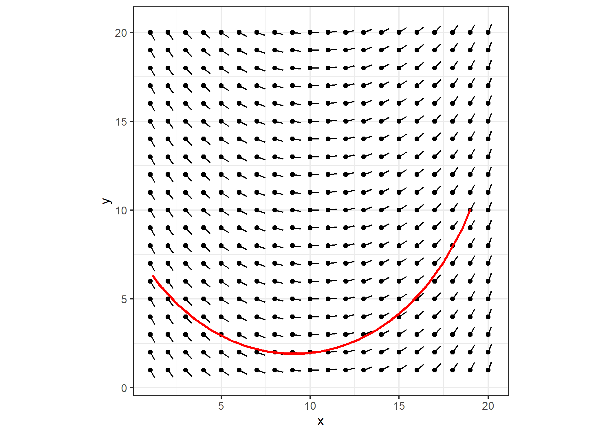
For generating one line, I’ll choose an arbitrarily long line segment to make sure the function doesn’t return a really short line.
set.seed(4)

df <- get_lines(m, 50, 1)

head(df)
##          x        y seg
## 1 1.161024 6.287313   1
## 2 1.219803 6.206411   1
## 3 1.278581 6.125510   1
## 4 1.337360 6.044608   1
## 5 1.396138 5.963706   1
## 6 1.454917 5.882805   1
Plotting is straight forward. I’ll just add the line to the previous plot p.
p +
  geom_path(data=df, aes(x=x, y=y, group=seg),
            color="red", size=1, lineend="round", linejoin="bevel") +
  theme(legend.position="none")
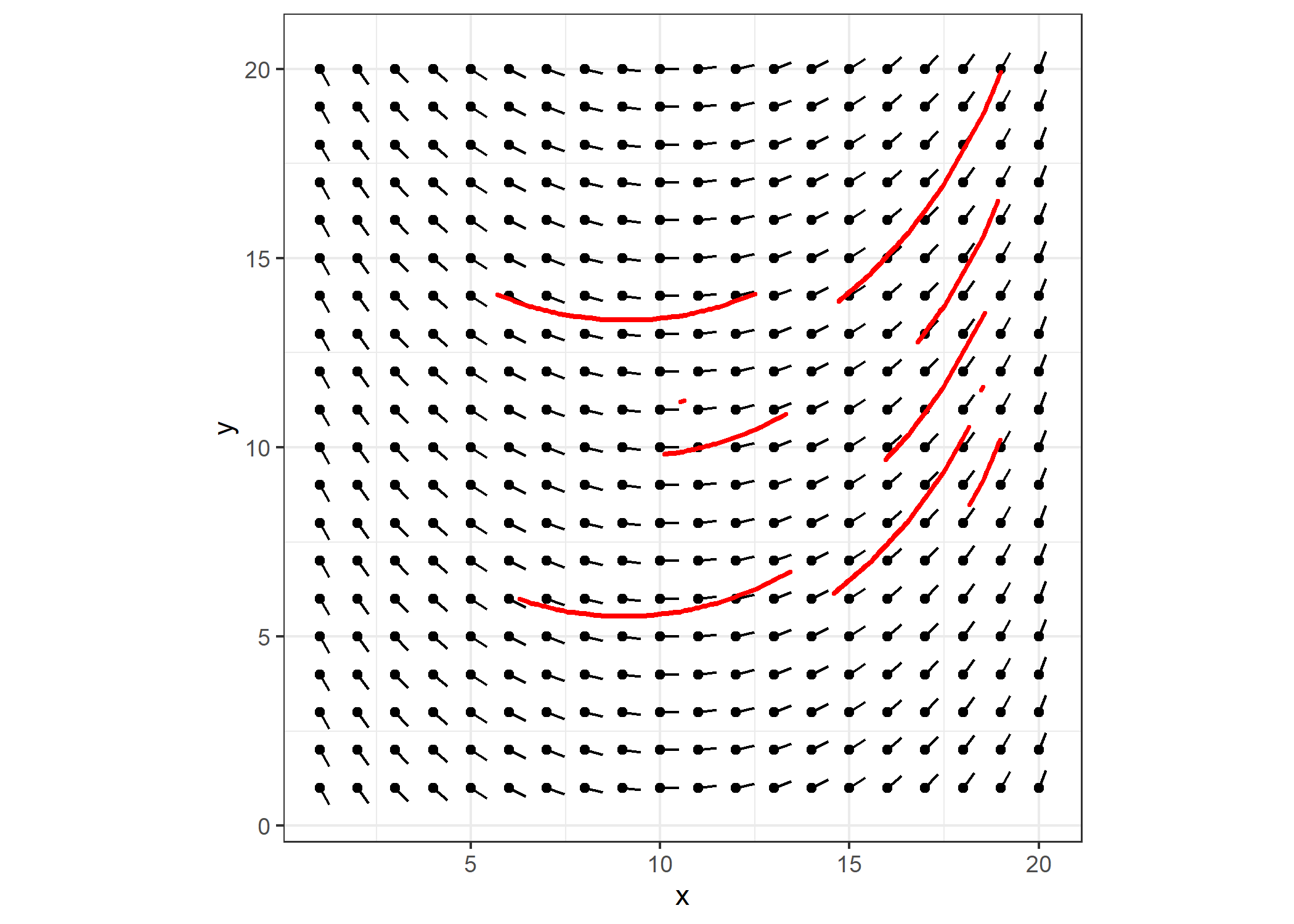
Plotting several lines of varying length, I get:
set.seed(4)

df <- get_lines(m, 5, 10)

p +
  geom_path(data=df, aes(x=x, y=y, group=seg),
            color="red", size=1, lineend="round", linejoin="bevel") +
  theme(legend.position="none")
Algorithm-Based Flow Fields
To make more visually interesting flow fields like Tyler’s at the beginning of this post, I first tried to continue to manipulate the flow field above by adding different amounts of curvature to different part of the field. I had a difficult time controlling it so that I didn’t have divergent areas and eventually gave up on that approach. Tyler stated that initializing the matrix with “Perlin noise” was common and provided pseudo code for how to do it. Unfortunately, the pseudo code didn’t actually demonstrate how generate Perlin noise from scratch, rather it referred to a hypothetical function to generate the noise and then the pseudo code further manipulated those results. Buggers.
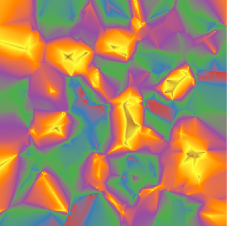
The Wikipedia article on Perlin noise stated that the algorithm
…typically involves three steps: defining a grid of random gradient vectors, computing the dot product between the gradient vectors and their offsets, and interpolation between these values.
And then provided about a page and a half of pseudo code to describe it. I wasn’t motivated enough to redo that in R, but at least the site showed some visualizations for what it looked like. Here’s one example.

It didn’t take much Googling to find an R package that generates Perlin noise. The package ambient does the trick with an aptly named noise_perlin() function that couldn’t be simpler to use. I’ll get a 20x20 matrix and plot it with the get_plot() function.
library(ambient)

m <- noise_perlin(c(20, 20))

get_plot(m) + ggtitle("Perlin Noise")
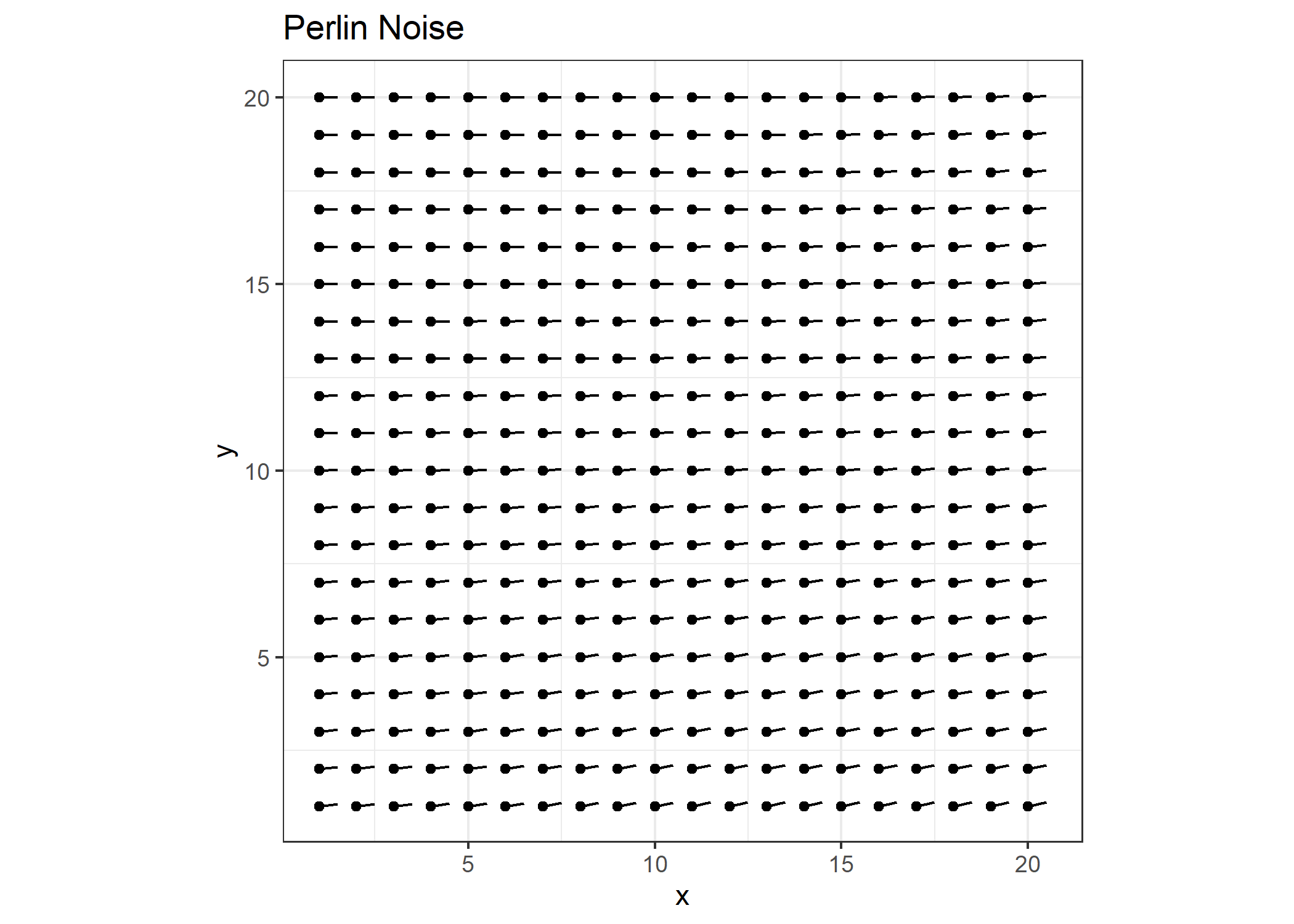
Well that’s not very interesting. Recall that we’re plotting these values as radians, and they just don’t vary enough as is. Note the range in values.
range(m)
## [1] 0.0000000 0.2337671
I’ll rescale them to range between -pi/2 and pi/2 and re-plot the values.
m2 <- scales::rescale(m, to=c(-pi/2, pi/2))

get_plot(m2) + ggtitle("Perlin Noise Rescaled")
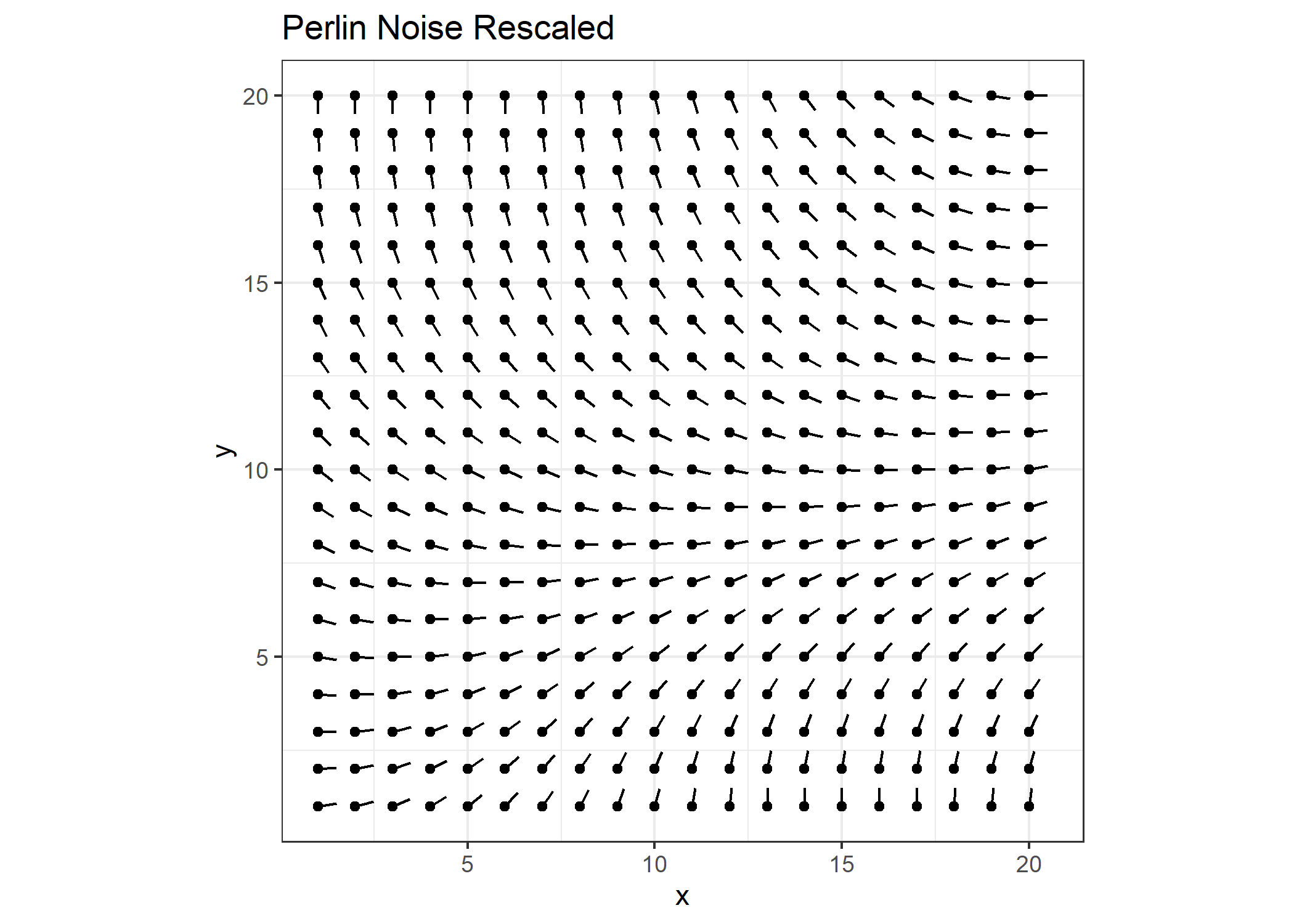
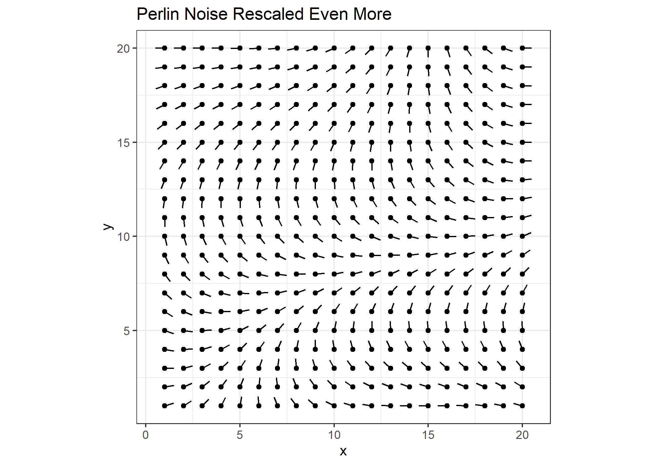
That’s better. I’ll increase the scale even more.
m3 <- scales::rescale(m, to=c(-pi, pi))

get_plot(m3)  + ggtitle("Perlin Noise Rescaled Even More")
I’ll create a figure like the one in Wikipedia to visualize the matrix values.
reshape2::melt(m3) %>%
  ggplot() +
  geom_tile(aes(x=Var1, y=Var2, fill=value)) +
  coord_fixed()
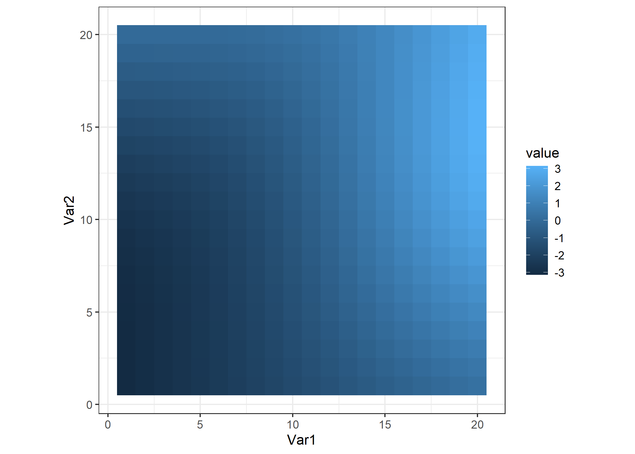
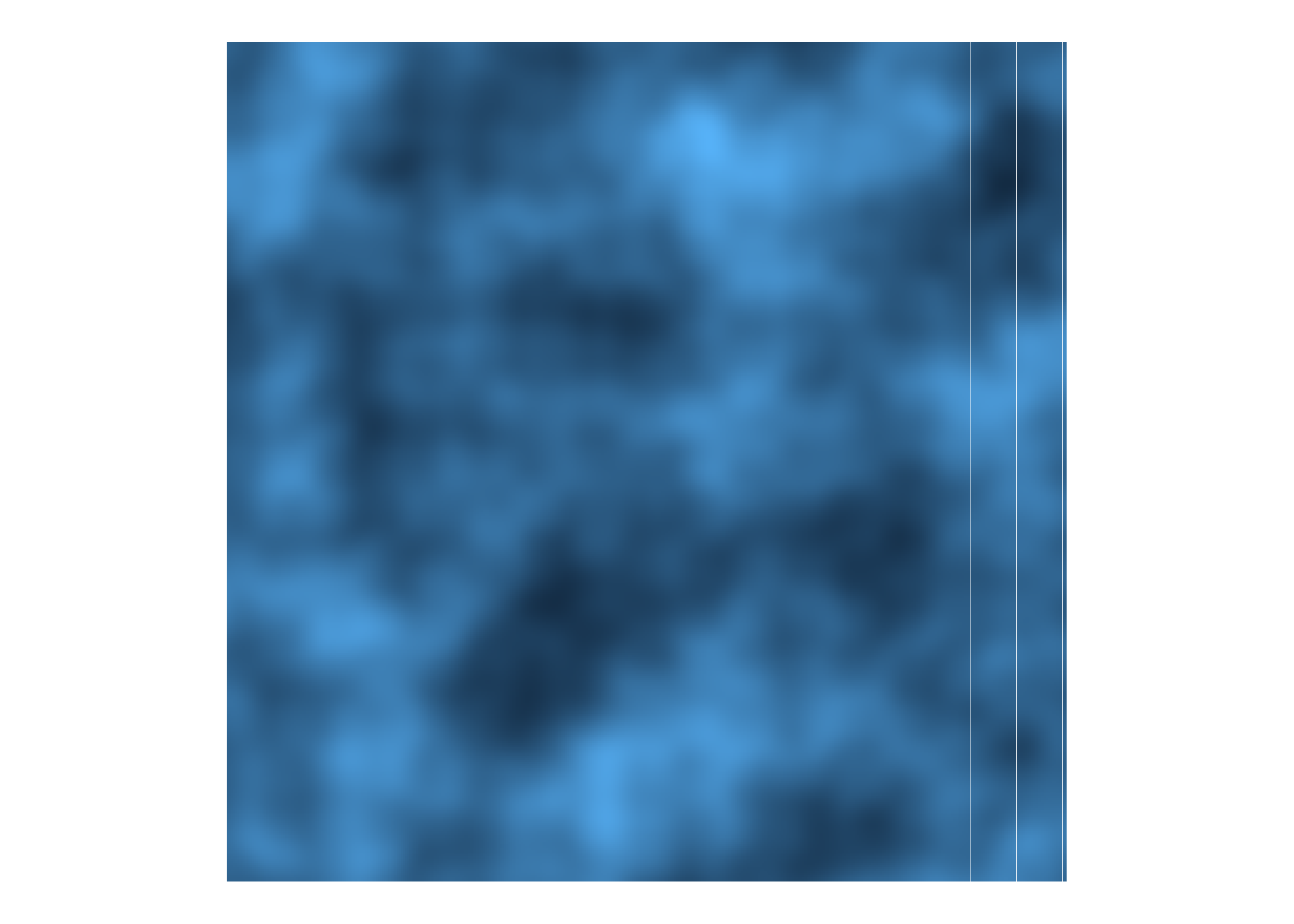
That’s underwhelming… We need a bigger matrix!
m <- noise_perlin(c(400,400))

reshape2::melt(m) %>%
  ggplot() +
  geom_tile(aes(x=Var1, y=Var2, fill=value)) +
  coord_fixed() +
  theme_void() +
  theme(legend.position="none")
We can pass different parameters to the noise_perlin() function to get different types of noise. For example:
m1 <- noise_perlin(c(100,100), fractal='fbm') # the default
m2 <- noise_perlin(c(100,100), fractal='billow')
m3 <- noise_perlin(c(100,100), fractal='rigid-multi')

p1 <- reshape2::melt(m1) %>%
  ggplot() +
  geom_tile(aes(x=Var1, y=Var2, fill=value)) +
  coord_fixed() +
  theme_void() +
  ggtitle("FBM") +
  theme(legend.position="none", plot.title = element_text(hjust = 0.5))

p2 <- reshape2::melt(m2) %>%
  ggplot() +
  geom_tile(aes(x=Var1, y=Var2, fill=value)) +
  coord_fixed() +
  theme_void() +
  ggtitle("Billow") +
  theme(legend.position="none", plot.title = element_text(hjust = 0.5))

p3 <- reshape2::melt(m3) %>%
  ggplot() +
  geom_tile(aes(x=Var1, y=Var2, fill=value)) +
  coord_fixed() +
  theme_void() +
  ggtitle("Rigid-Multi") +
  theme(legend.position="none", plot.title = element_text(hjust = 0.5))

gridExtra::grid.arrange(p1, p2, p3, nrow=1)
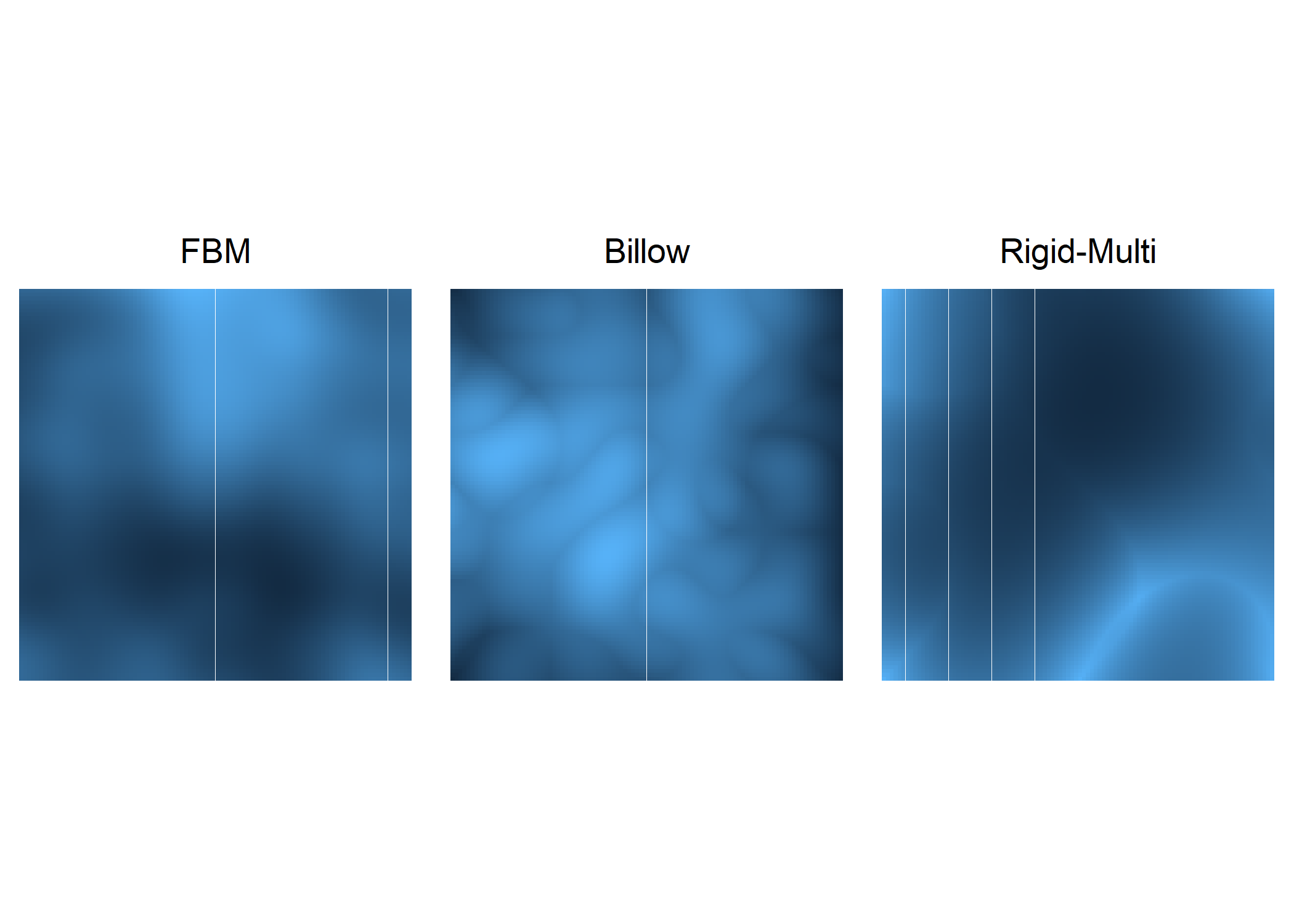
From these images, we can see that the choice in fractal will have a large impact on the resulting art. Speaking of which, time to make some!
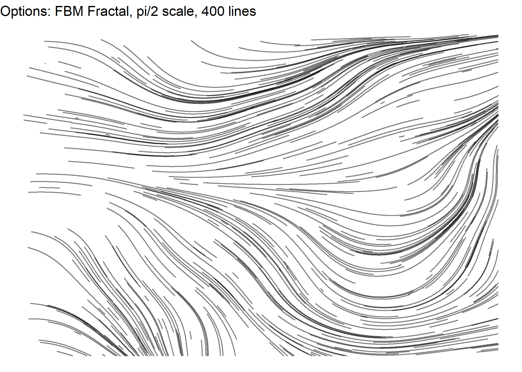
m <- noise_perlin(c(100,100))
m <- scales::rescale(m, to=c(-pi/2, pi/2))

get_lines(M=m, segment_length=5, num_lines=400)  %>%
  ggplot() +
  geom_path(aes(x=x, y=y, group=seg),
            color="black", alpha=0.5, size=0.5, lineend="round", linejoin="bevel") +
  theme_void() +
  theme(legend.position="none") +
  ggtitle("Options: FBM Fractal, pi/2 scale, 400 lines")
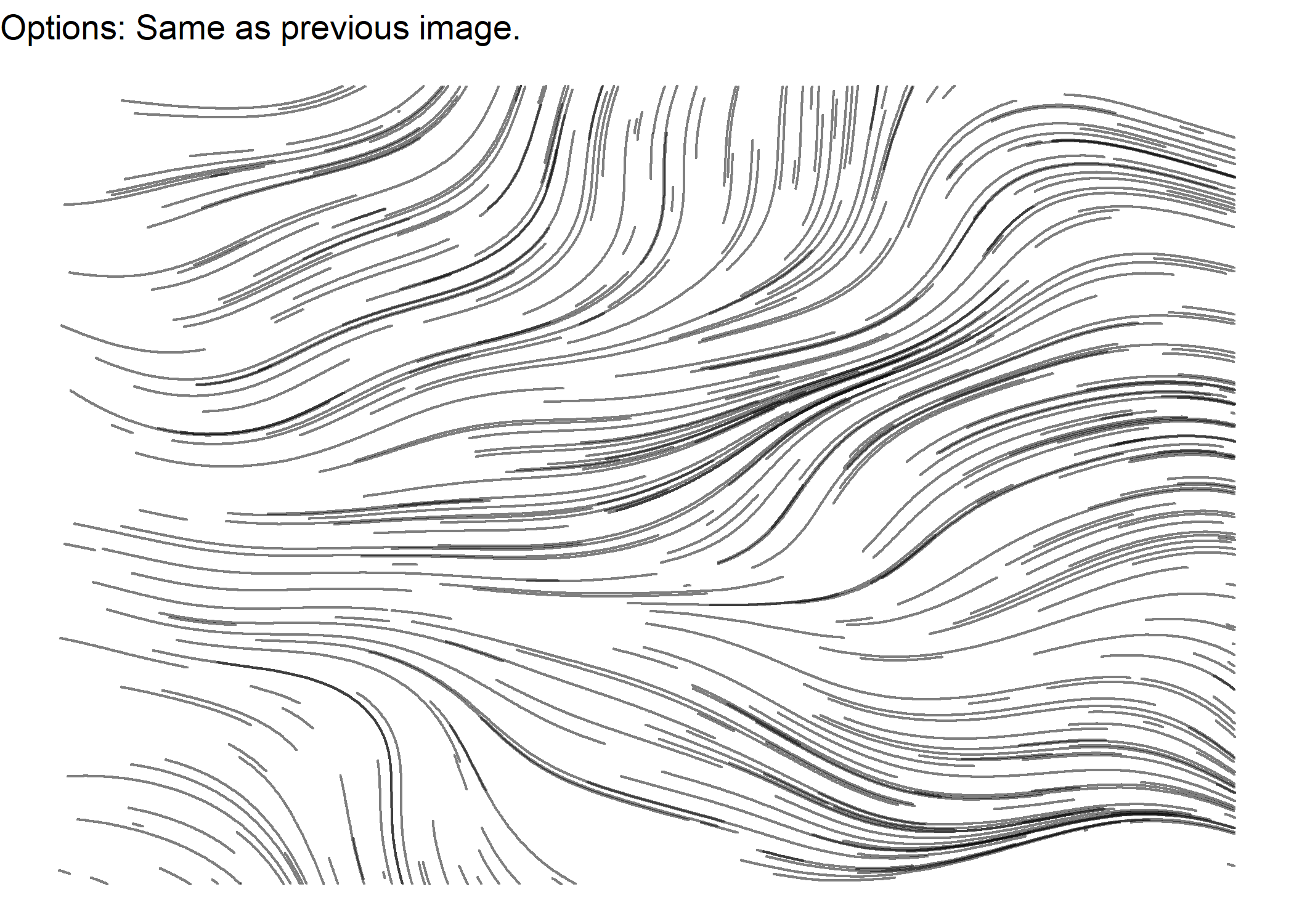
m <- noise_perlin(c(100,100))
m <- scales::rescale(m, to=c(-pi/2, pi/2))

get_lines(M=m, segment_length=5, num_lines=400)  %>%
  ggplot() +
  geom_path(aes(x=x, y=y, group=seg),
            color="black", alpha=0.5, size=0.5, lineend="round", linejoin="bevel") +
  theme_void() +
  theme(legend.position="none") +
  ggtitle("Options: Same as previous image.")
m <- noise_perlin(c(100,100), fractal='billow')
m <- scales::rescale(m, to=c(-pi, pi))
get_lines(M=m, segment_length=5, num_lines=800) %>%
ggplot() +
geom_path(aes(x=x, y=y, group=seg, color=seg),
alpha=0.5, size=0.5, lineend="round", linejoin="bevel") +
theme_void() +
theme(legend.position="none") +
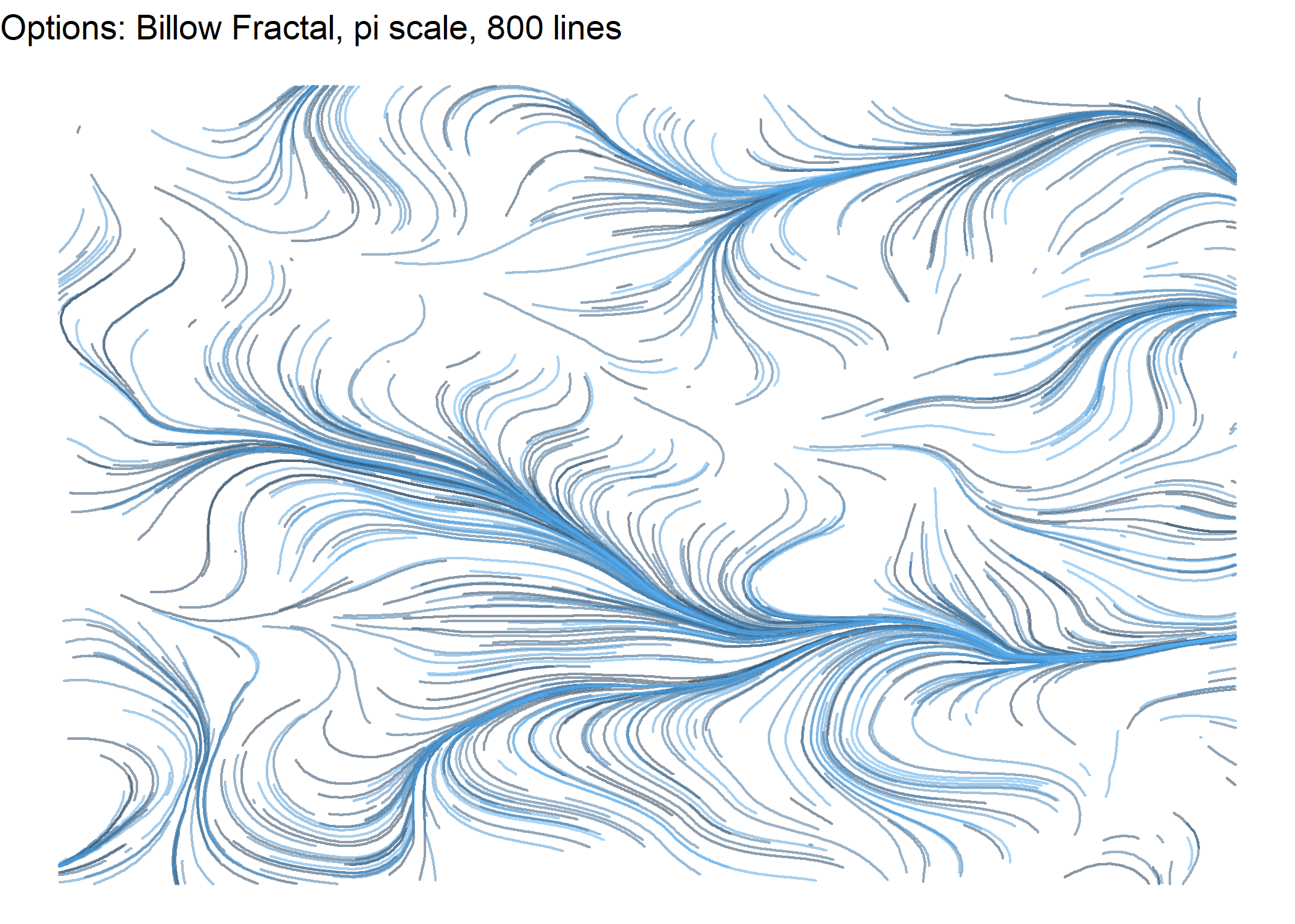
ggtitle("Options: Billow Fractal, pi scale, 800 lines")
m <- noise_perlin(c(100,100), fractal='rigid-multi')
m <- scales::rescale(m, to=c(-pi/4, pi/4))
get_lines(M=m, segment_length=5, num_lines=800) %>%
ggplot() +
geom_path(aes(x=x, y=y, group=seg, color=seg),
alpha=0.5, size=1, lineend="round", linejoin="bevel") +
theme_void() +
theme(legend.position="none") +
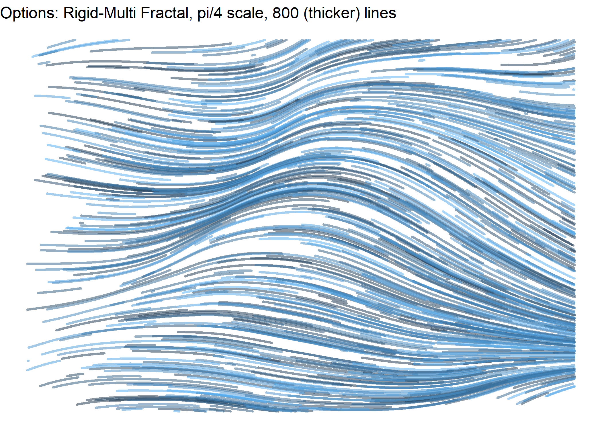
ggtitle("Options: Rigid-Multi Fractal, pi/4 scale, 800 (thicker) lines")
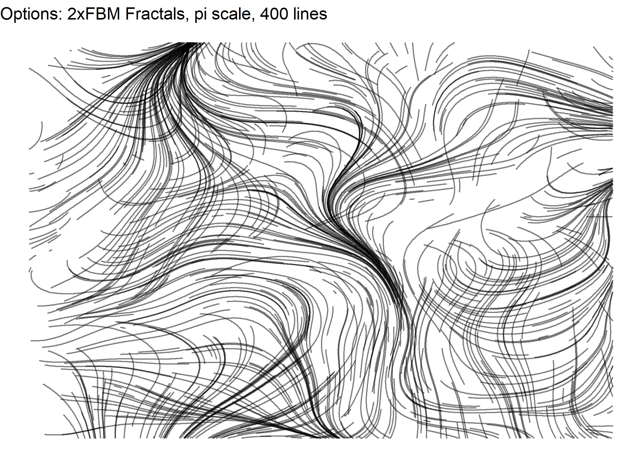
m <- noise_perlin(c(100,100))
m <- scales::rescale(m, to=c(-pi, pi))
df <- get_lines(M=m, segment_length=5, num_lines=400)

m <- noise_perlin(c(100,100))
m <- scales::rescale(m, to=c(-pi, pi))
df2 <- get_lines(M=m, segment_length=5, num_lines=400)

ggplot() +
  geom_path(data=df, aes(x=x, y=y, group=seg),
            color="black", alpha=0.5, size=0.5, lineend="round", linejoin="bevel") +
  geom_path(data=df2, aes(x=x, y=y, group=seg),
            color="black", alpha=0.5, size=0.5, lineend="round", linejoin="bevel") +
  theme_void() +
  theme(legend.position="none") +
  ggtitle("Options: 2xFBM Fractals, pi scale, 400 lines")
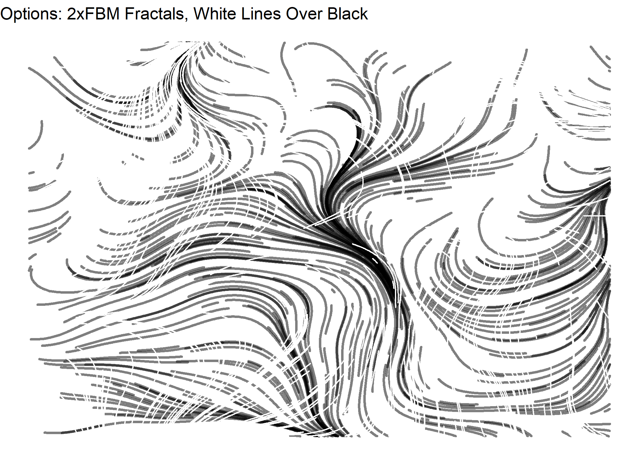
ggplot() +
  geom_path(data=df, aes(x=x, y=y, group=seg),
            color="black", alpha=0.5, size=1, lineend="round", linejoin="bevel") +
  geom_path(data=df2, aes(x=x, y=y, group=seg),
            color="white", size=1, lineend="round", linejoin="bevel") +
  theme_void() +
  theme(legend.position="none") +
  ggtitle("Options: 2xFBM Fractals, White Lines Over Black")
From what I’ve seen in other posts, this is just the tip of the iceberg of the type of generative art from flow fields. Here are a few ideas.
- Place starting points for lines on a grid instead of randomly.
- Place several starting points for lines together in a tight circle.
- Place starting points on just one side of the canvas.
- Change the color of lines as they increase in length.
- Change the thickness of lines as they increase in length.
To try any of these, I’ll either need to modify the get_lines() function or just forget about the function and just write some code. I think I’ll just write some code, but I won’t show it because it’s somewhat trivial and just gets in the way of comparing the images.
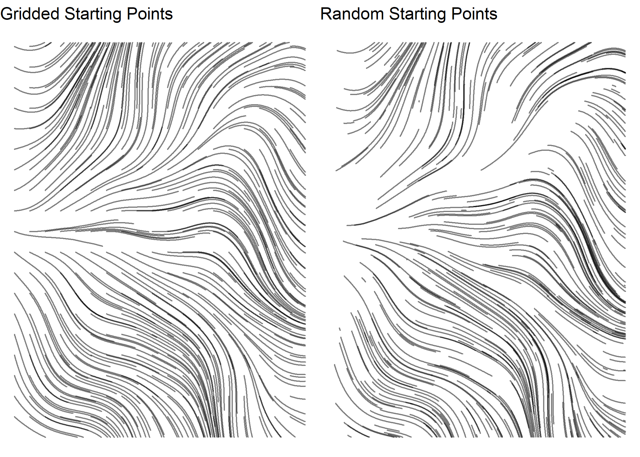
Gridded Starting Lines
For the gridded example, I also made the length of the lines a constant. The grid itself is apparent in the image below, which might not be desireable.
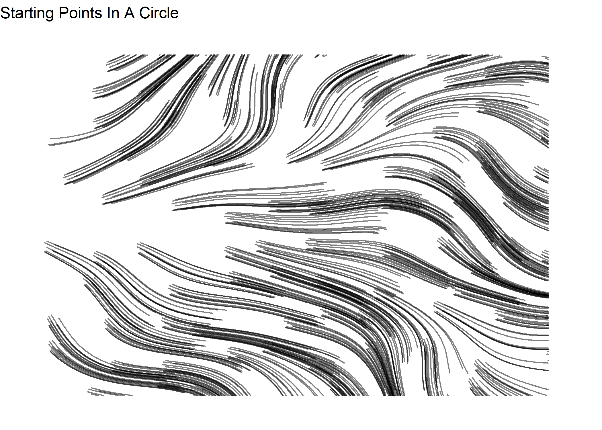
Starting Points In A Circle
I also added jitter to the starting points in an attempt to get rid of the grid effect in the previous image.
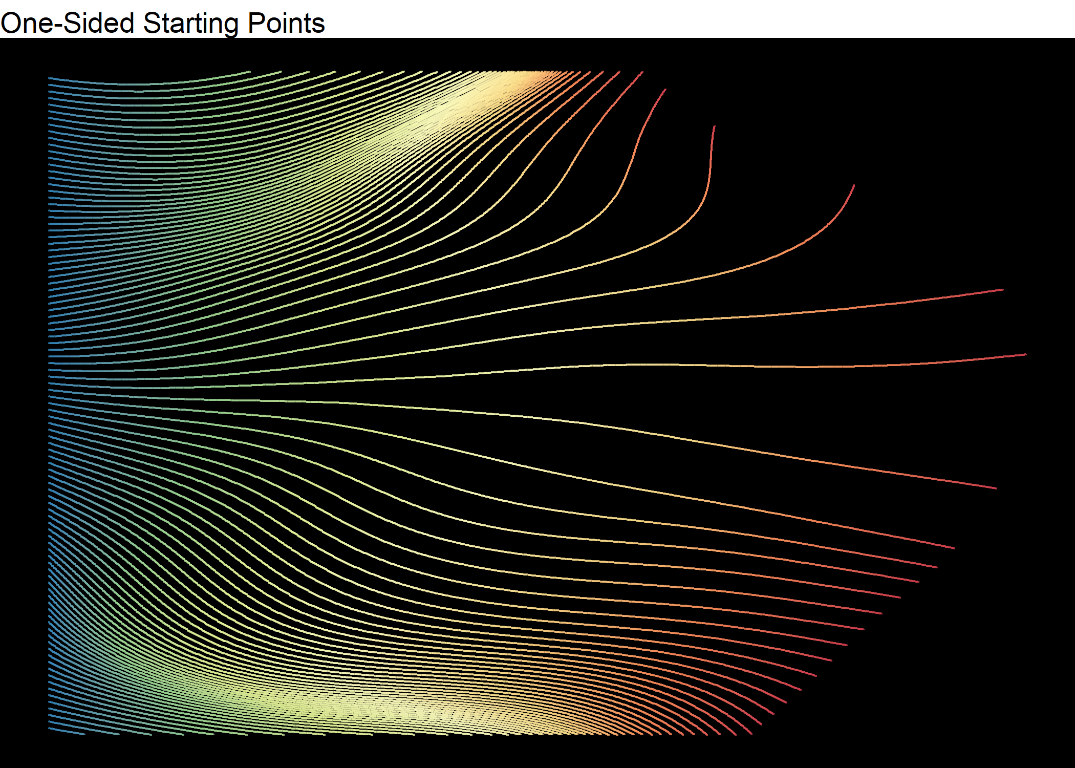
Starting Points On Just One Side And Color Gradient Along Lines
I like the spectral color palette on a black background, so changing up several things in this plot. Using a color palette like this with perfectly drawn lines definitely makes it look computer generated.
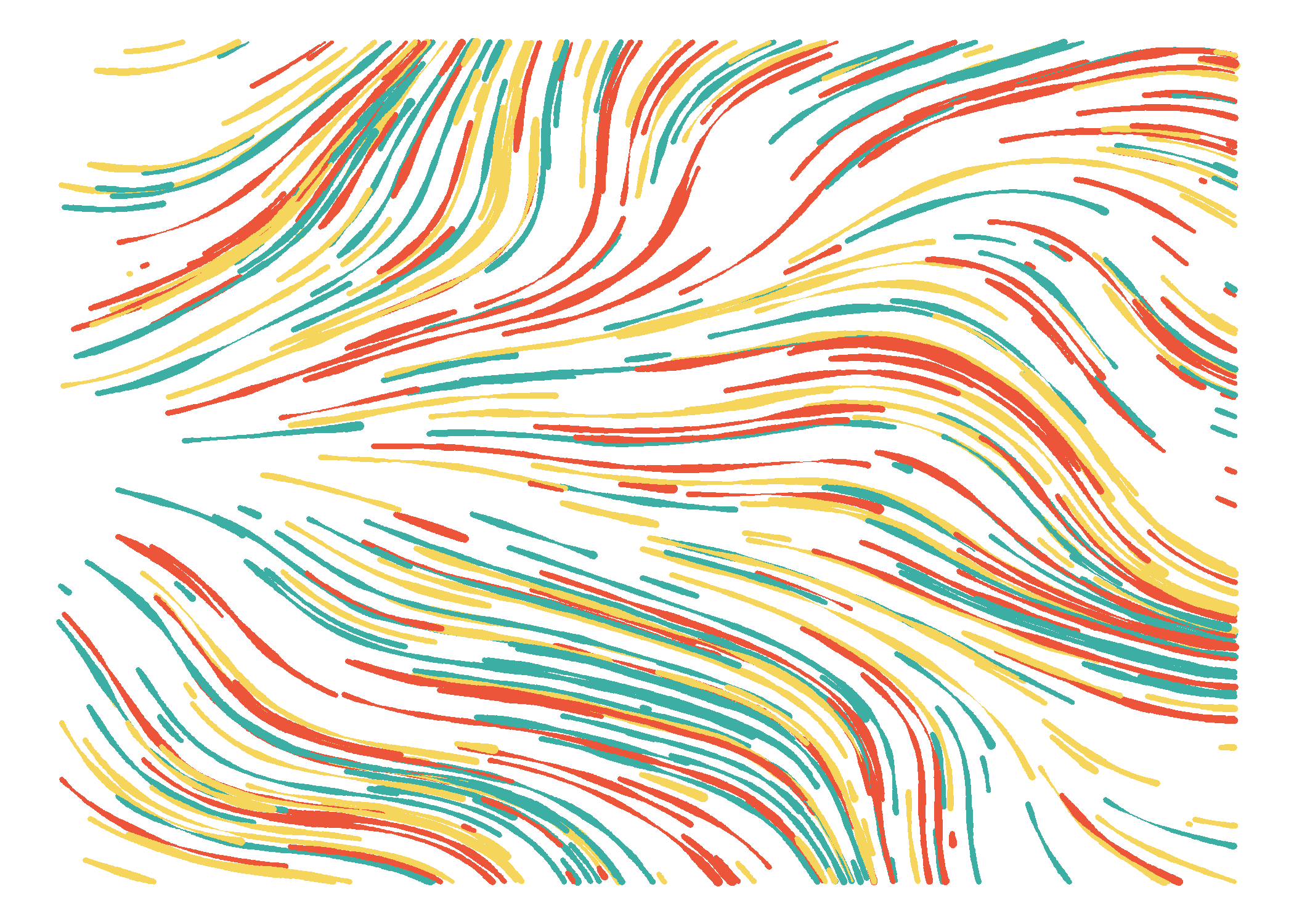
Change Line Thickness
To come full circle, I use Perlin noise to change the width of the lines.
You can click here for my Shiny app to generate your own art using this and other algorithms.
Comments