
KNN Art
The generative art journey continues with images produced from machine learning models. In this post, I’ll use k-nearest neighbors to produce two types of art: one that sometimes resembles gemstones, and another that resembles a mosaic.
Generating the Data
The k-nearest neighbors (KNN) algorithm has been around since the 1950’s and can be used for both classification and regression tasks. Describing the algorithm is beyond the scope of this post, and a simple Google search will produce many detailed explanations. Besides, for art purposes, I’m really not interested in the underlying math, the model accuracy, or any of that. I just need any model that makes predictions about my response variable z based on my predictors x and y.
There are two model hyperparameters that effect the art: k (the k from k-nearest neighbors) and the type of kernel. It actually doesn’t even really matter what those are and how they impact the model. I will just include them as something to experiment with when generating KNN art.
I mentioned there are two types of art - gemstones and mosaics. The only change needed to produce one type versus the other is by specifying a continuous response variable for gemstones and a categorical response variable for mosaics.
Gemstones
It’s surprisingly simple to generate the data for either type of art. I first create a train data set that I’ll use to train the model. It consists of 100 random values for the x and y predictor variables and 100 random, continuous values for the response variable z. The test data set is a regular grid of x and y values from 1 to 500. The model will make predictions for each of these 500 x 500 = 250,000 observations that will be visualized in the art.
With these two data sets, I fit the KNN model with the two hyperparameters I mentioned. All that’s relevant is that k can be any integer greater than 0, and the kernel can be “rectangular”, “triangular”, “epanechnikov”, “biweight”, “triweight”, “cos”, “inv”, “gaussian”, “rank”, or “optimal”. I’ll start with k = 3 and a triangular kernel.
library(kknn)
set.seed(1)

train <- data.frame(x=runif(100, 0, 500), y=runif(100, 0, 500), z=runif(100))
test <- expand.grid(x=1:500, y=1:500)
#train <- data.frame(x=runif(100, 0, 500), y=runif(100, 0, 500), z=factor(sample(1:5, 100, replace=TRUE)))

knn <- kknn(z~., train, test, k=3, kernel="triangular")
Now that the model is fit, I just need to extract the predictions (aka, the “fitted” values). Since the predictions are a grid of x and y values from 1 to 500, I can just think of them as an image with 500x500 pixels, which I’ll visualize with geom_tile() from ggplot2. I’ll also use color palettes from RColorBrewer.
library(ggplot2)
library(RColorBrewer)
test$z <- fitted(knn) # get the predictions
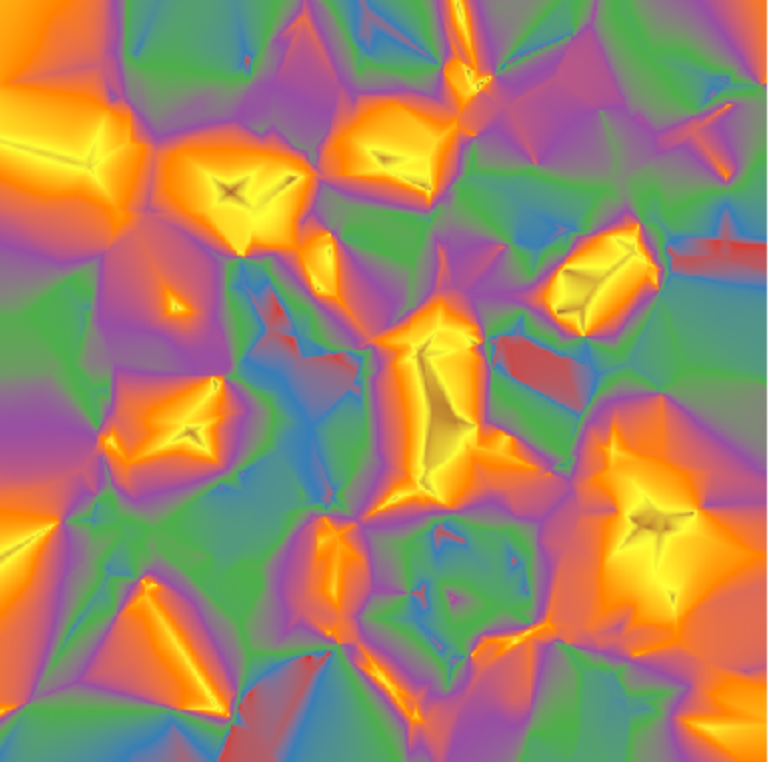
ggplot(test) +
geom_tile(aes(x=x, y=y, fill=z)) +
scale_fill_distiller(palette = "Set1") +
coord_fixed() +
theme_void() +
theme(legend.position="none")
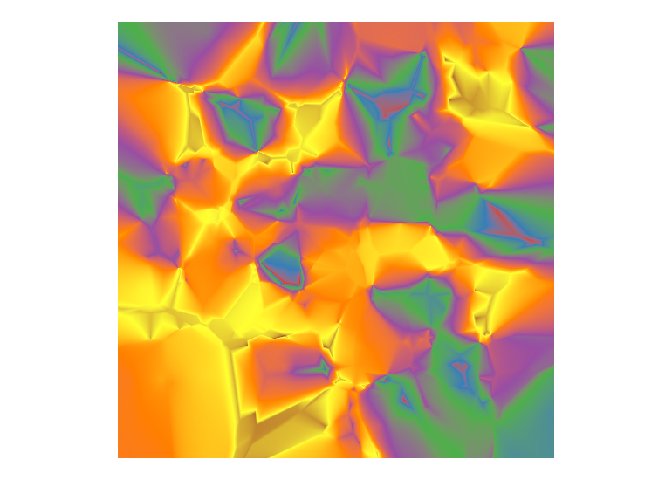
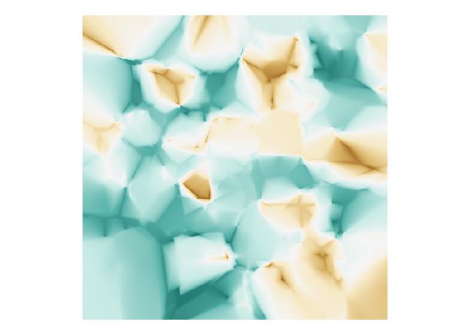
Does that look gemstone-ish? The color palette has a fair amount to do with it. Choosing a brown-blue-green palette produces a turquoise-looking image, I think.
ggplot(test) +
  geom_tile(aes(x=x, y=y, fill=fitted(knn))) +
  scale_fill_distiller(palette = "BrBG") +
  coord_fixed() +
  theme_void() +
  theme(legend.position="none")
Now I’ll try different values for k, some different kernel choices, and a different color palette. A convenient way of dealing with this kind of situation in which k is numeric and the kernel choices are strings is to combine all combinations of the two with the cross2() function from purrr. I then pipe that into the future_map2() function from the furrr package to run the processes in parallel and create a list of plots. The cowplot package is useful for arranging non-faceted plots in a grid and can accept the list of plots with the plotlist argument.
library(furrr)
plan(multisession, workers = 4)
library(magrittr)

x <- c(3, 9, 18)
y <- c("rectangular", "triangular", "gaussian")

plots <-
  purrr::cross2(x, y) %>%
  furrr::future_map(function(l){
    knn <- kknn(z~., train, test, k=l[[1]], kernel=l[[2]])

    ggplot(test) +
      geom_tile(aes(x=x, y=y, fill=fitted(knn))) +
      scale_fill_distiller(palette = "PuOr") +
      coord_fixed() +
      theme_void() +
      ggtitle(paste("k =", l[[1]], "kernel =", l[[2]])) +
      theme(legend.position="none", plot.title = element_text(size=10))
  })

cowplot::plot_grid(plotlist = plots, ncol=3)
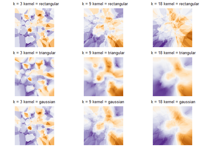
Generally speaking, a higher k seems to produce a more gradual transition between colors, and the choice of kernel also has a profound impact. Personally, I find that a low k with a triangular kernel tends to produce more gemstone-like images, but it ultimately comes down to the look you’re going for.
Mosaics
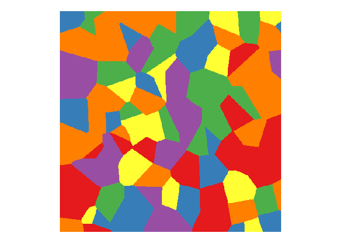
I just need one simple change for mosaic-looking art: specify a categorical response variable. I’ll create a six-level categorical z variable in the train data that I’ll randomly sample. Except for the use of scale_fill_brewer() and a different palette, the rest of the code is identical to the above.
train <- data.frame(x=runif(100, 0, 500), y=runif(100, 0, 500), z=factor(sample(1:6, 100, replace=TRUE)))

knn <- kknn(z~., train, test, k=1, kernel="triangular")

ggplot(test) +
  geom_tile(aes(x=x, y=y, fill=fitted(knn))) +
  scale_fill_brewer(palette = "Set1") +
  coord_fixed() +
  theme_void() +
  theme(legend.position="none")
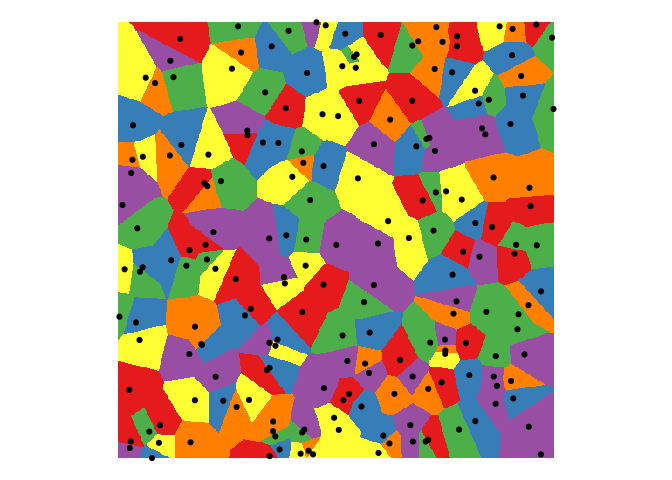
Through experimenting, I found that more training observations result in smaller mosaic “tiles”, which makes sense when you plot the training data observations. More dots produce more tiles.
train <- data.frame(x=runif(200, 0, 500), y=runif(200, 0, 500), z=factor(sample(1:6, 200, replace=TRUE)))

knn <- kknn(z~., train, test, k=1, kernel="triangular")

ggplot(test) +
  geom_tile(aes(x=x, y=y, fill=fitted(knn))) +
  geom_point(data=train, aes(x=x, y=y)) +
  scale_fill_brewer(palette = "Set1") +
  coord_fixed() +
  theme_void() +
  theme(legend.position="none")
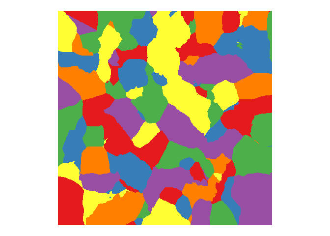
In the above examples, I used a k of 1, which produces nice straight mosaic boundaries (because it’s only trained on the k=1 nearest neighbor). A higher value of k results in rounded and sometimes jagged boundaries, which isn’t very mosaic-y.
knn <- kknn(z~., train, test, k=7, kernel="triangular")

ggplot(test) +
  geom_tile(aes(x=x, y=y, fill=fitted(knn))) +
  scale_fill_brewer(palette = "Set1") +
  coord_fixed() +
  theme_void() +
  theme(legend.position="none")
You can click here for my Shiny app to generate your own art using this and other algorithms. Enjoy!
Comments