
COVID-19 Visualizations
I recently found the GitHub repository for the Johns Hopkins University Center for Systems Science and Engineering online dashboard, so I thought I’d do a little data visualization myself.
Read and Clean Data
The data is stored in one .csv file per day, and the format of the data changed over time, so here’s an inelegant way to bludgeon through it. At the end, I have a covid dataframe that includes most of the data.
library(tidyverse)
library(viridis)

file_list = list.files()
file_list = file_list[-length(file_list)]

for (i in 1:39){
  if (i==1){
    covid = read.csv(file_list[i], stringsAsFactors = FALSE,
                     col.names=c('State', 'Country', 'LU', 'Confirmed', 'Deaths', 'Recovered'))
    covid$Day = file_list[i]}
  else{
    temp = read.csv(file_list[i], stringsAsFactors = FALSE,
                    col.names=c('State', 'Country', 'LU', 'Confirmed', 'Deaths', 'Recovered'))
    temp$Day = file_list[i]
    covid = rbind(covid, temp)}
}
covid = covid[, c(1,2,4,5,6,7)]

for (i in 40:60){
  if (i==40){
    covid_n = read.csv(file_list[i], stringsAsFactors = FALSE,
                       col.names=c('State', 'Country', 'LU', 'Confirmed', 'Deaths', 'Recovered', 'Lat', 'Long'))
    covid_n = covid_n[, c(1,2,4,5,6)]
    covid_n$Day = file_list[i]}
  else{
    temp = read.csv(file_list[i], stringsAsFactors = FALSE,
                    col.names=c('State', 'Country', 'LU', 'Confirmed', 'Deaths', 'Recovered', 'Lat', 'Long'))
    temp = temp[, c(1,2,4,5,6)]
    temp$Day = file_list[i]
    covid_n = rbind(covid_n, temp)}
}

covid = rbind(covid, covid_n)

for (i in 61:79){
  if (i==61){
    covid_n = read.csv(file_list[i], stringsAsFactors = FALSE,
                       col.names=c('fips','admin', 'State', 'Country', 'LU', 'Lat', 'Long', 'Confirmed', 'Deaths', 'Recovered','Active', 'key'))
    covid_n = covid_n[, c(3,4,8,9,10)]
    covid_n$Day = file_list[i]}
  else{
    temp = read.csv(file_list[i], stringsAsFactors = FALSE,
                    col.names=c('fips','admin', 'State', 'Country', 'LU', 'Lat', 'Long', 'Confirmed', 'Deaths', 'Recovered','Active', 'key'))
    temp = temp[, c(3,4,8,9,10)]
    temp$Day = file_list[i]
    covid_n = rbind(covid_n, temp)}
}

covid = rbind(covid, covid_n)

covid[is.na(covid)] = 0
covid = as_tibble(covid)
covid = covid %>% mutate(Country = str_replace(Country, 'Mainland China', 'China'))

rm(covid_n, temp)

head(covid, 10)
| State | Country | Confirmed | Deaths | Recovered | Day |
|---|---|---|---|---|---|
| Anhui | China | 1 | 0 | 0 | 01-22-2020.csv |
| Beijing | China | 14 | 0 | 0 | 01-22-2020.csv |
| Chongqing | China | 6 | 0 | 0 | 01-22-2020.csv |
| Fujian | China | 1 | 0 | 0 | 01-22-2020.csv |
| Gansu | China | 0 | 0 | 0 | 01-22-2020.csv |
| Guangdong | China | 26 | 0 | 0 | 01-22-2020.csv |
| Guangxi | China | 2 | 0 | 0 | 01-22-2020.csv |
| Guizhou | China | 1 | 0 | 0 | 01-22-2020.csv |
| Hainan | China | 4 | 0 | 0 | 01-22-2020.csv |
| Hebei | China | 1 | 0 | 0 | 01-22-2020.csv |
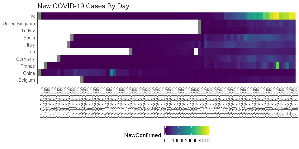
An idea I had was to make a heatmap with time on the x-axis, countries on the y-axis, and the heatmap color representing the number of new COVID cases each day. After looking at the data, I realized that the COVID cases were cumulative counts, so to get just the day’s new cases, I subtract the previous day’s count from the current day’s count.
newc = covid %>%
  group_by(Country, Day) %>%
  summarize(TotalConfirmed = sum(Confirmed),
            TotalDeaths = sum(Deaths),
            TotalRecovered = sum(Recovered)) %>%
  mutate(NewConfirmed = TotalConfirmed - lag(TotalConfirmed))
There are a lot of countries in the dataset, so I’ll just focus on the 10 countries with the highest maximum daily number of new cases.
top10 = covid %>%
  group_by(Country) %>%
  summarize(MaxConfirmed = max(Confirmed)) %>%
  arrange(desc(MaxConfirmed)) %>%
  slice(1:10) %>% .$Country
## set universal plot size:
options(repr.plot.width=8, repr.plot.height=4)

ggplot() +
  geom_tile(data=newc%>%filter(Country %in% top10), aes(x=Day, y=Country, fill=NewConfirmed)) +
  scale_fill_viridis(discrete=FALSE) +
  theme_bw() +
  ggtitle("New COVID-19 Cases By Day") +
  theme(legend.position = "bottom",
        axis.text.x = element_text(angle = 90, hjust = 1),
        panel.grid = element_blank(),
        axis.title = element_blank(),
        axis.ticks = element_blank(),
        panel.background = element_blank())
How about just a line for each country?
ggplot() +
  geom_line(data=newc %>% filter(Country %in% top10), aes(x=Day, y=NewConfirmed, group=Country, color=Country)) +
  theme_bw() +
  ggtitle("New COVID-19 Cases By Day") +
  theme(legend.position = "bottom",
        panel.grid.major.x = element_blank(),
        axis.text.x = element_blank(),
        panel.background = element_blank())
Warning message:
"Removed 10 rows containing missing values (geom_path)."

Now how about the map-based plot like the one on the Johns Hopkins dashboard? I need to get the latitude and longitude from the most recent day.
apr9 = read.csv(file_list[79], stringsAsFactors = FALSE,
                    col.names=c('fips','admin', 'State', 'Country', 'LU', 'Lat', 'Long', 'Confirmed',
                                'Deaths', 'Recovered','Active', 'key'))
w = map_data('world')

ggplot() +
  geom_polygon(data=w, aes(long, lat, group=group), fill='black', color='gray20') +
  geom_point(data=apr9, aes(x=Long, y=Lat, size=Confirmed), alpha=0.4, color='red') +
  theme_void() +
  theme(panel.background = element_rect(fill = "black"),
        plot.background = element_rect(fill = "black"),
        legend.position = "none") +
  coord_quickmap()
Warning message:
"Removed 61 rows containing missing values (geom_point)."


Comments